


 Unboxed")
")


Xiaomi Brings Out MIUI 6 For Developers

Xiaomi is growing and how, the young Chinese company has earned tremendous brand recognition in a short period. Its Android based UI, the MIUI has been a recognized and well-appreciated interface. Lot many folks are impressed by the regular updates and superior customizability of the UI. The company announced that it will be bringing the next version of the UI, the MIUI 6 for developers, and it will be out for the users very soon.
The company released a teaser video of what the new MIUI would look like and true to Xiaomi’s design approach; the new UI looks rather close to iOS 7. Xiaomi doesn’t make it a secret that they derive some of their “inspiration” from Apple products, and this one seems to fall just in line.
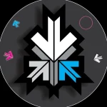
MIUI 6 will follow a minimalistic design pattern with lots of colors. It will also have enhanced security and new features such as immersive parallax effect on apps like clock.
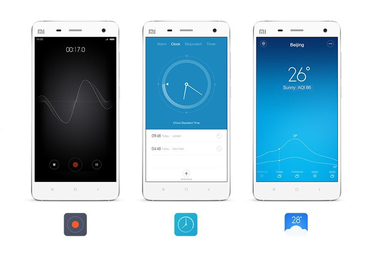
Minimalistic Look with subtle graphics.
The new update according to Xiaomi will be less distracting, and if the visuals are to be believed, the clean interface has some sweet graphics backing it. The new phonebook allows you to identify unknown callers; mark service numbers (as banks, scams, sales) and see a visible menu of the carrier’s hotline numbers so you can easily choose your option without trying to decipher the IVRS.
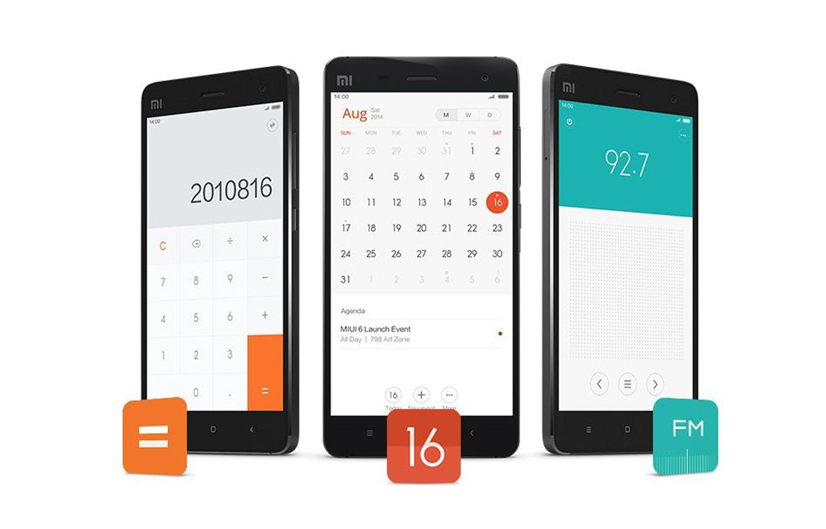
MIUI 6 will have new gestures for the home-screen and a redesigned notification shade with toggles for various settings. The notification center shows notifications on the lock-screen and the UI has support for more than 5,000 theme options.
The Flat design is almost reminiscent of sticky pads.
The flat design sure makes some of the apps seems as if they are sticky notes. The translucent features of the UI stand out and give dimension to the content that is also visually appealing.
The Color options are visually appealing.
The Color options are visually appealing.
The Color options are visually appealing.
The Color options are visually appealing.
Overall, the design is clean and easy on the eyes and will definitely impress the seasoned MIUI users as well as new adopters. But it’s time the company took a departure from blatantly copying Apple; even their website follows the Apple design. Now that the company is out of the Chinese borders and made its mark in countries across the globe, it needs an identity for itself. The company is still ahead in terms of product design, both interiors and exterior, than many of its competitors, but “Apple copycats” is not the tag they want when attracting a wide audience.