


 Unboxed")
")


Apple iOS 7 : The Good And The Bad

While developers around the world have been running iOS 7 on their iDevices for quite some time now, commoners began receiving the much hyped and much awaited update last night.
We take a look at the good and the bad things that Apple has introduced in the new OS.
The Good
1. Multi-Tasking
In iOS 7, Apple has completely retooled the way multitasking (or switching between apps if we want to be a tad more precise) works. While beckoning the app switcher in iOS 7 remains the same — a quick double tap on the home button — the entire implementation has been completely retooled.
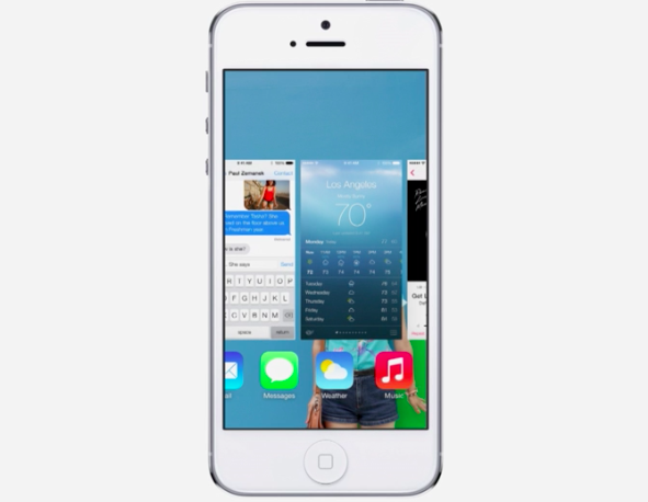
Apps can now take advantage of full background multitasking but as always, you don’t have to close apps for battery saving reasons. Apple does a great job of freezing them in place so they don’t suck up your battery life.
2. Control Center And Notification Center
The first thing each iDevice owner did after jailbreaking his/her device was to add shortcut toggles for simple utilities like turning WiFi on and off, Airplane mode, BlueTooth etc. Finally, Apple decided to incorporate this feature into the OS itself, with iOS featuring a brand new Control Center.
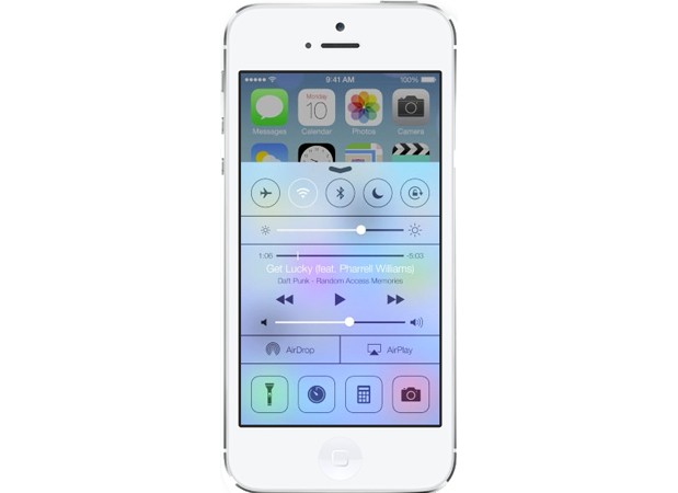
By flicking upwards from the bottom of the screen, you can enable or disable Airplane Mode, Wi-Fi, Bluetooth, and Do Not Disturb; adjust the volume and brightness; pause or play music; enable AirDrop and AirPlay; and quickly access your camera’s LED light (for use as a flashlight), timer, calculator, and camera.
The Notifications panel also undergoes a makeover with it being divided into 3 categories.
3. AirDrop
In iOS 7, not only can you quickly send photos, videos, and contacts using AirDrop, but just about anything from any app that has the share button (with the exception of music). The only problem is that it only works on iPhone 5 or later because of the chip architecture in the iPhone 4S.
4. Email Management
Swiping right on an email in iOS 7 lets you delete the message, as always. But now it also reveals a “More” icon that you can tap to see more options, including the ability to move the email into a folder, mark it as unread or mark it as “junk.” With so many third-party apps vying to be your go-to iOS mail app, Apple seriously needed to beef up Mail—and it did, with this and other enhancements.
The Bad
1. Icons
When Apple gave the world its first glimpse of iOS 7 in June, professional designers and ordinary iPhone users alike were struck by the radical visual changes that the company had made to its signature mobile operating system. While Apple touted the brighter, flatter, and simpler design as the “biggest change to iOS since the introduction of the iPhone,” members of the design community denounced the new interface as “ugly,” “childish,” and “inconsistent.”
![]()
At the center of the criticism were iOS 7’s new home screen application icons, whose lush, metaphorical designs were replaced by colorful, geometric abstractions. Safe to say they aren’t pleasing everyone.
2. Rough Installation
After downloading iOS 7, it took us six tries to actually install it. Granted, we attempted to install the OS the day of its release, late in the night—which was probably peak time for Apple’s servers. But we still think Apple should have been able to predict the demand and been better prepared.
3. Siri
Siri continues to get better, it’s still nowhere near being a feature that won’t frustrate you more than help you.
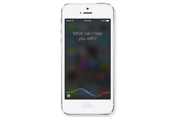
Many times, it won’t be able to connect or won’t have an answer, and anytime it can’t help you quickly, it ends up taking up much more of your time as you dig through the phone to find an app you realize you should have opened in the first place.
4. Awkward Contrasts
When Apple showed off iOS 7 in June, it was pretty proud of how the new icons seemed to float above the background wallpaper to create an almost 3-D effect. In real life, the interaction between iOS 7 and the screen background is challenging at best. Because groups of apps stored together no longer are set off with a black background and white border, they adapt to the wallpaper colors behind them.
The results are mixed. Sometimes, you get offsetting contrast, sometimes you don’t. Worse still, the white text is often not so easy to read against the background, because the new font is thinner. You may find yourself experimenting with wallpapers to get it right.
What do you think? Which features impressed you the most and which made you flinch? Let us know in the comments section below!


